Introduction
In late 2018, I was tasked with adding a true mixed-reality device to Upskill's supported device lineup. This device was the Microsoft HoloLens. HoloLens has been on the market since March of 2016, but relatively few companies were using it to build at-scale enterprise solutions and, due to the age of the hardware, there were multiple challenges to solve for the design.
Challenges:
- Aging hardware
- Small FoV (both horizontal and vertical)
- Novel interaction experience with limited gestures
- Biomechanics / Fatigue of repetitive motions
- How to translate existing, task-based workflow architecture into immersive 6DoF experience
- Managing user's "Minority Report" expectations meeting the "mixed" reality of a first gen device
Interaction design
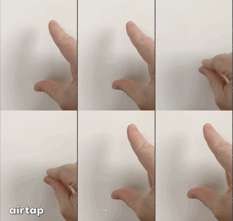
The first thing I had to solve for on HoloLens was the limited gesture support. If you are not familiar with the device, there is really only one gesture available:
|
Combined with a positional cursor (plotted via a raycast out from the center of your face) which is rendered as a circular cursor on interaction targets, all UX interaction had to be limited to just pinches or a pinch+hold gesture.
Moreover, in user studies, it quickly became obvious that users would need to be trained to perform this unnatural gesture, rather than doing what they wanted to do naturally: Tap and press on what they saw. |
|
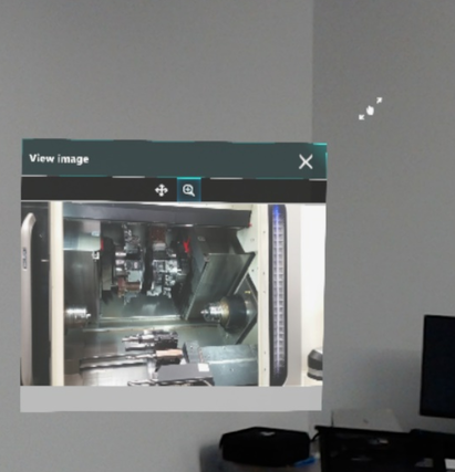
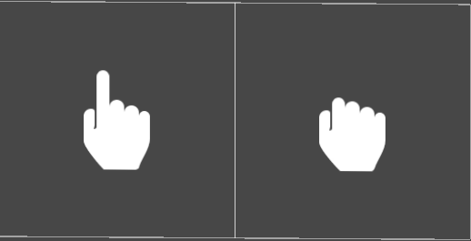
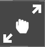
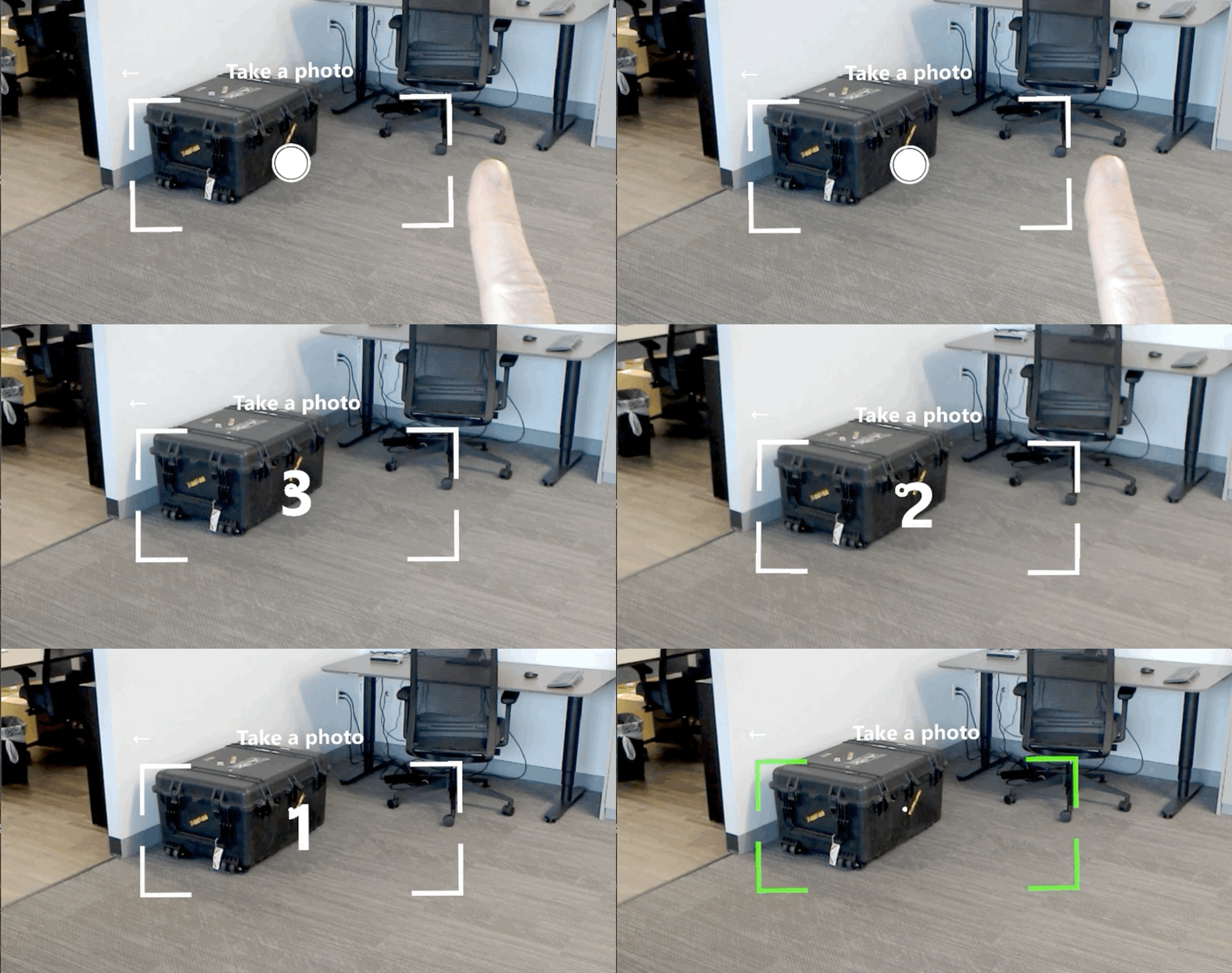
To train the user to perform the air tap gesture, I introduced a cursor change to the default cursor ring.
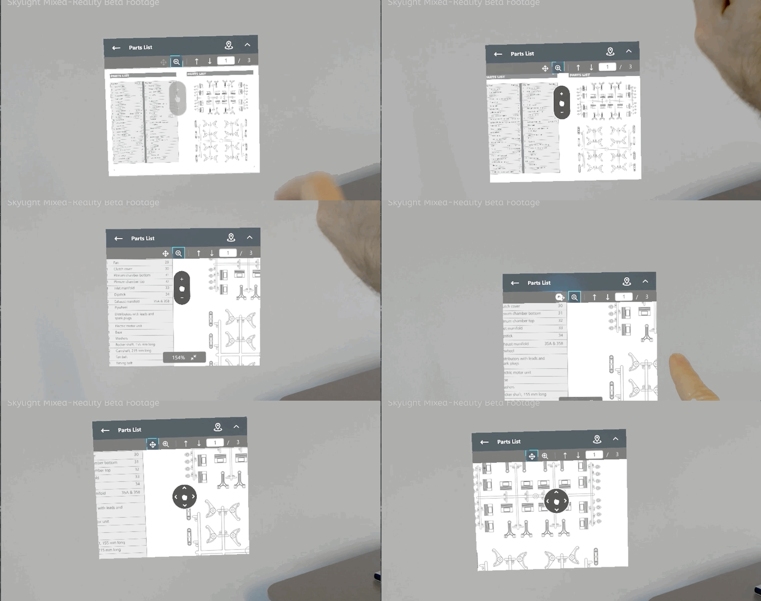
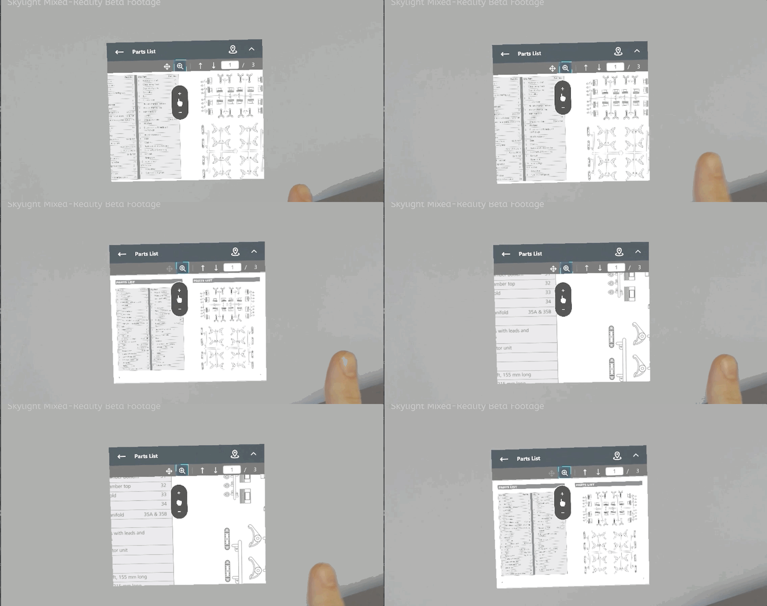
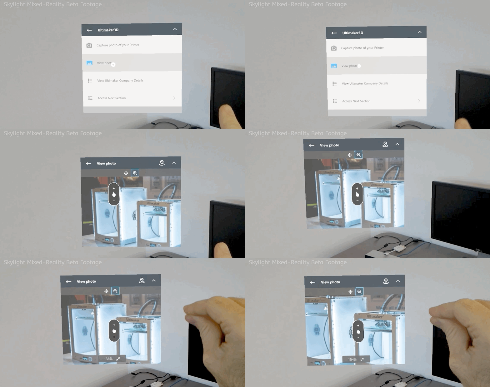
When a user's gaze fell on a target that could be interacted with in a specific way, such as on a window that could be resized or zoomed into, an interaction cursor would appear. The hand inside the cursor would respond to the user's own hand to reinforce when they accurately performed the air tap gesture. This helped reduced false-taps (where the user thought they performed the gesture correctly, but in fact had their hand positioned in such a way that the device camera could not accurately detect it). |
Example interactions
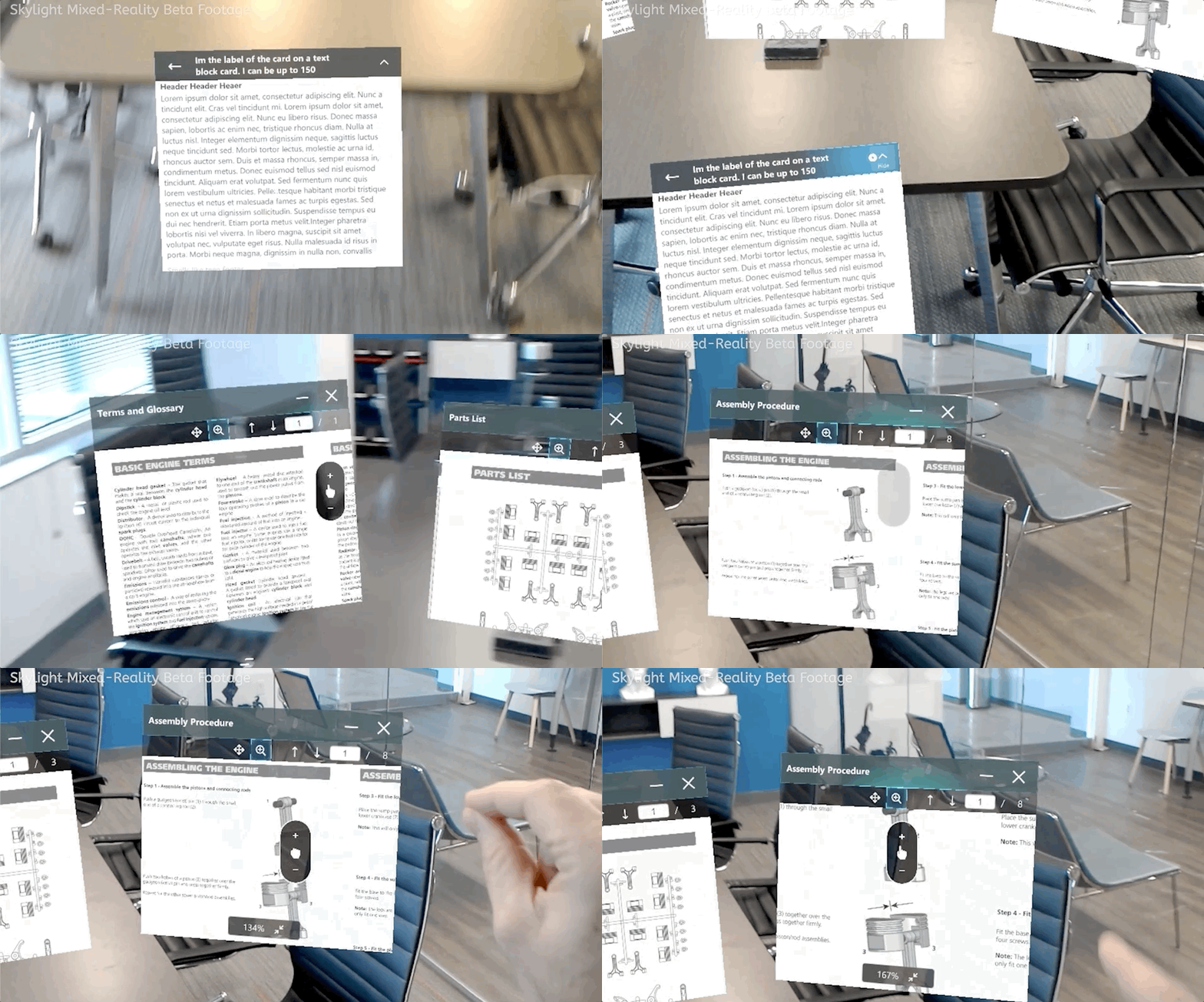
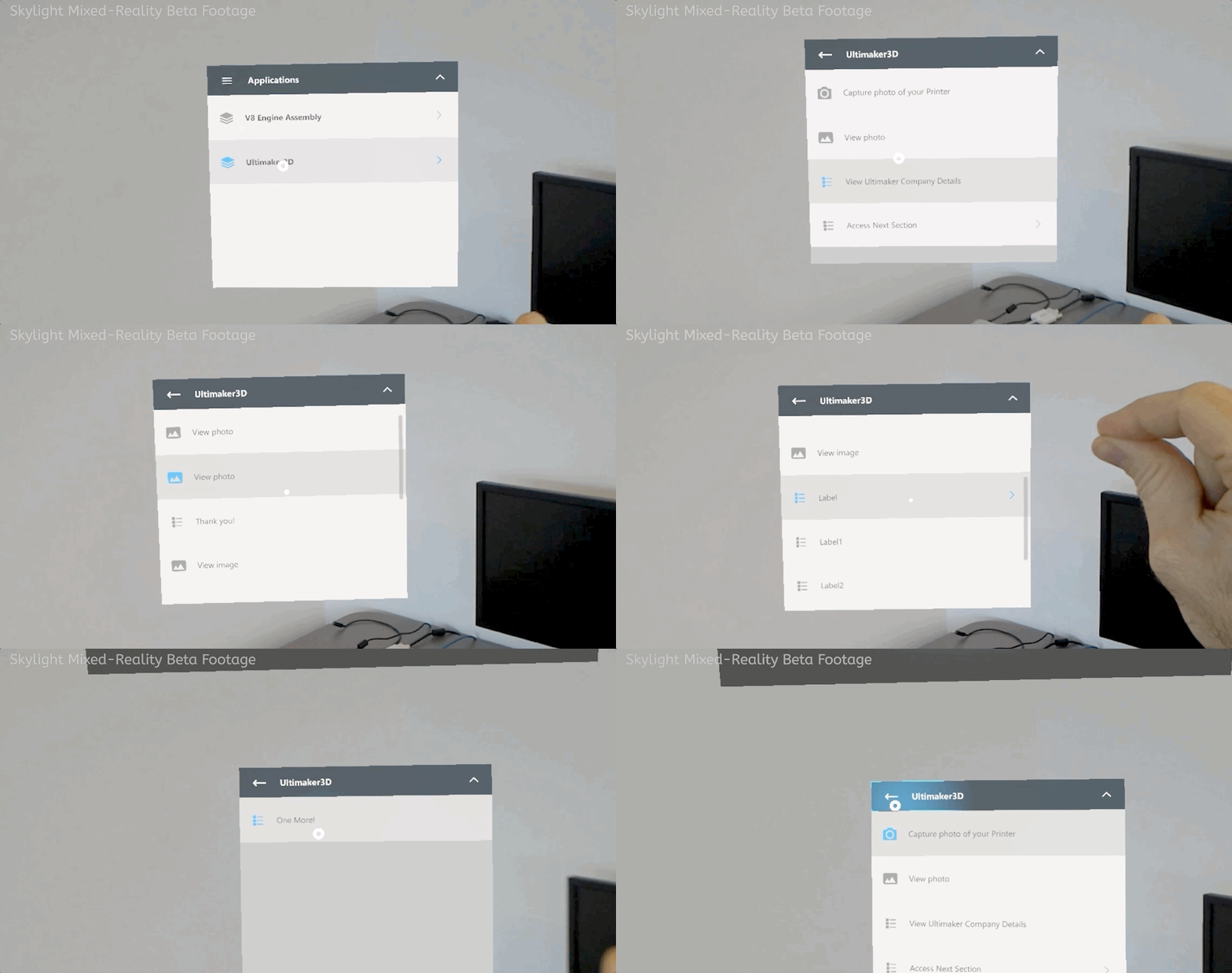
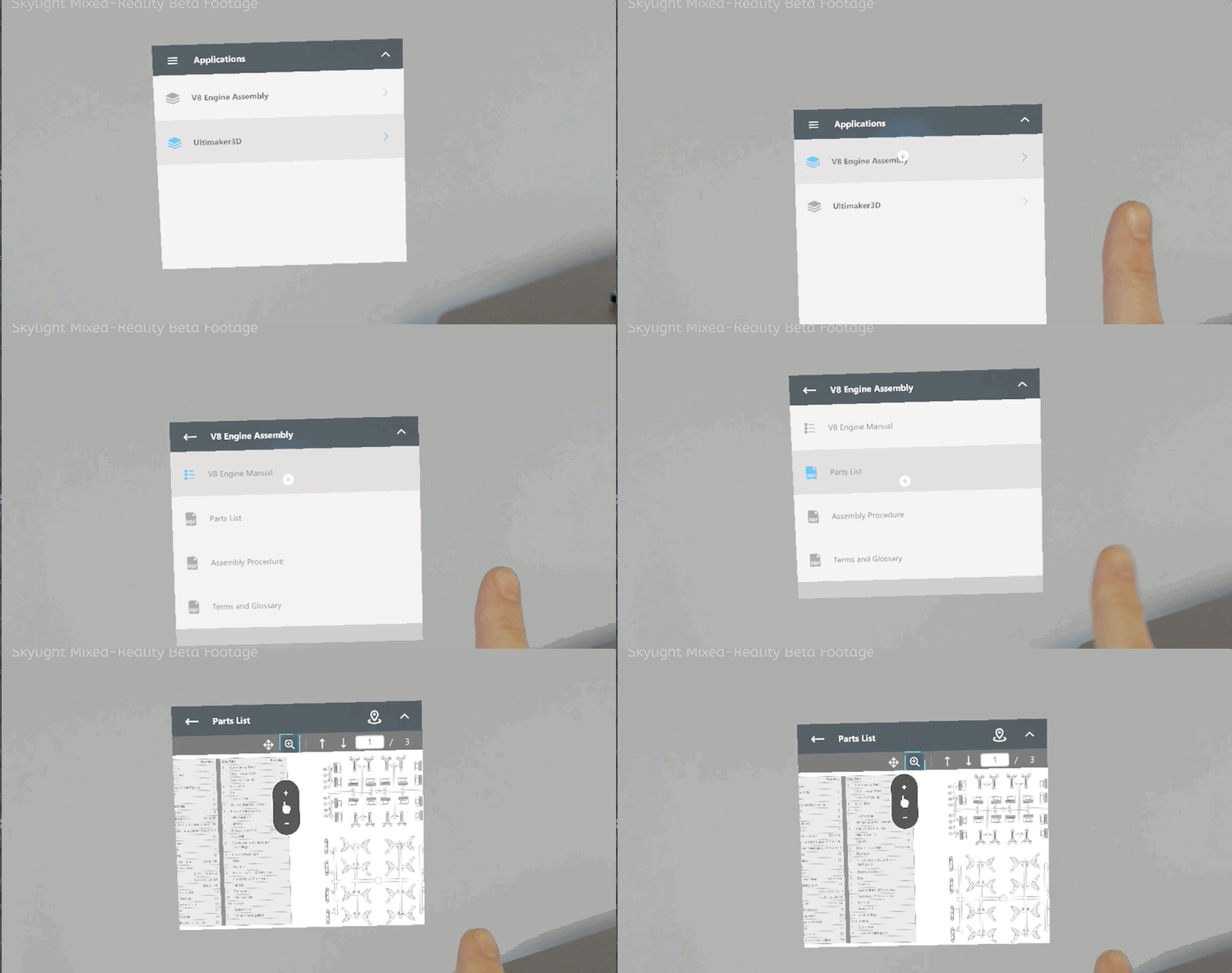
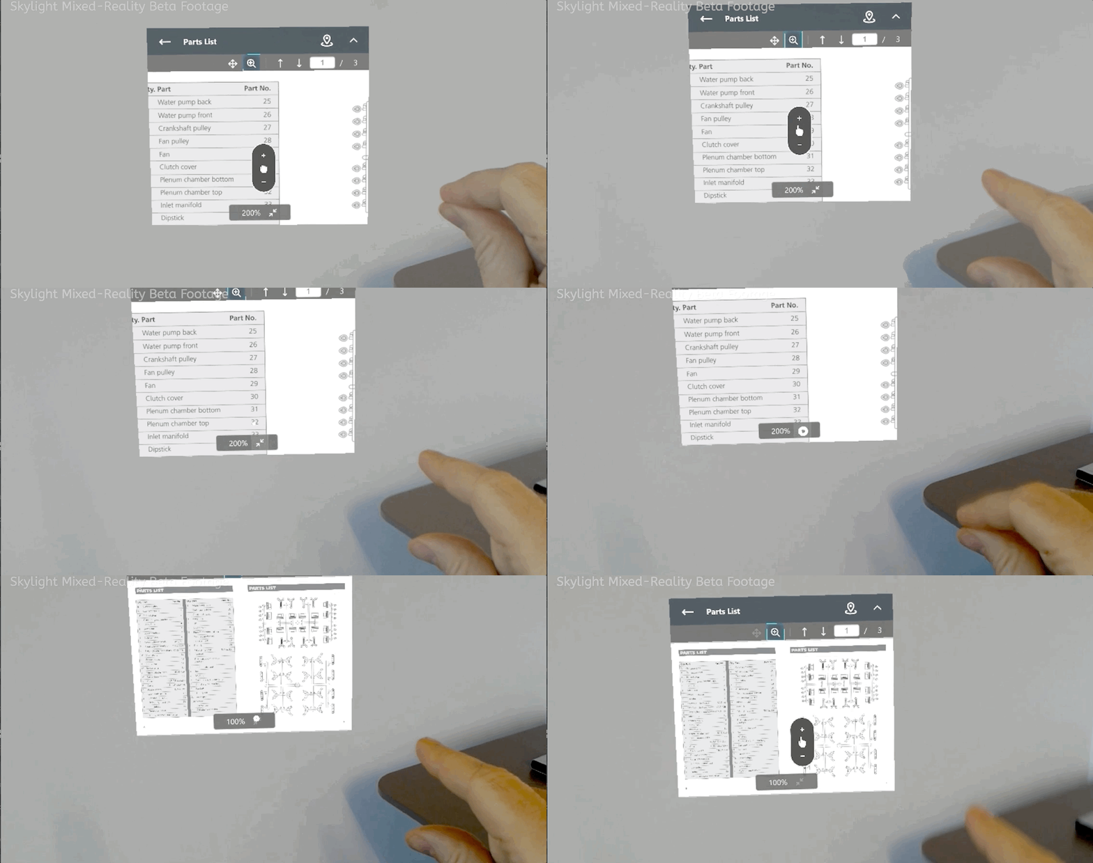
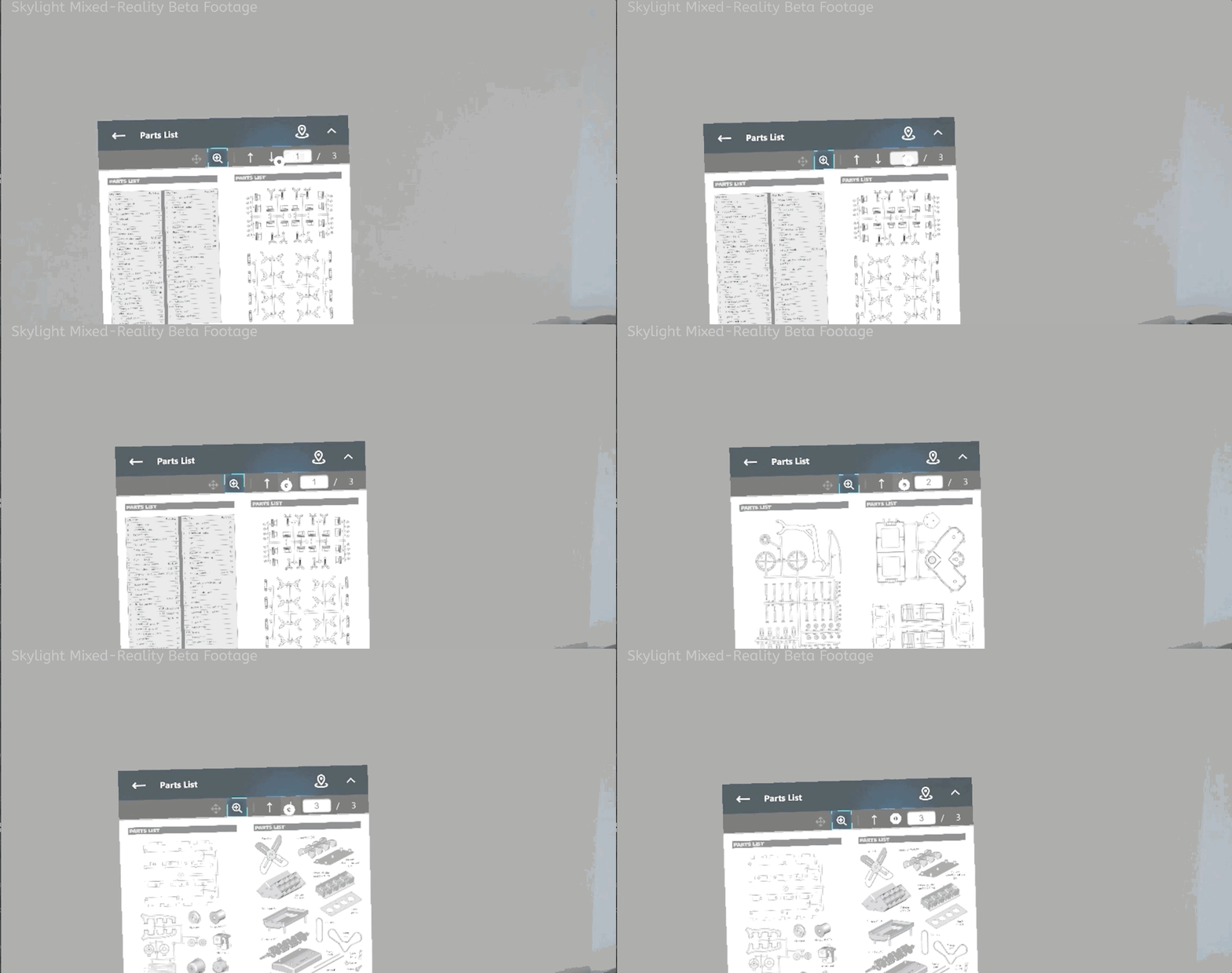
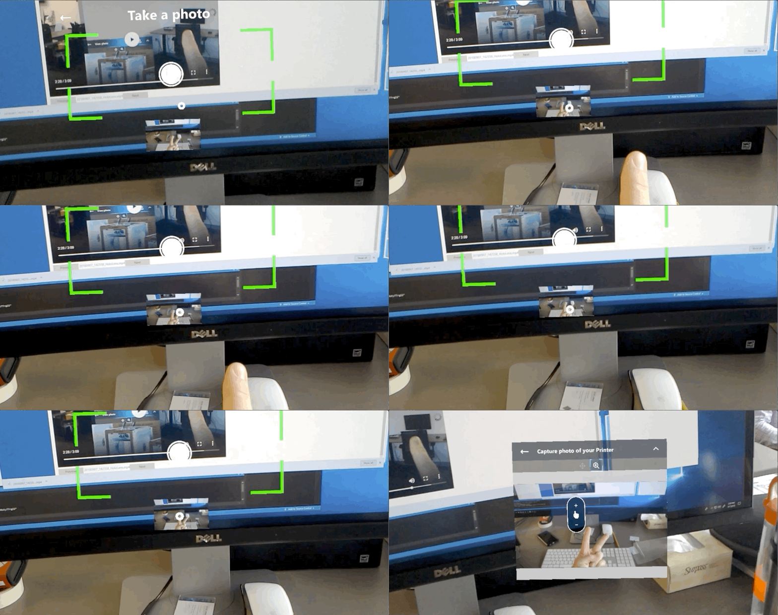
Combining UI state changes (hover) with cursor changes allowed for a variety of intuitive and easily discoverable interactions on the Skylight for HoloLens client.
" Peter Lipman is the archetype of a successful UX/Art Director. He not only was able to create the first design guides that I've ever followed to the " T ", he also taught me how to lead by doing. His amazing ability to visualize complex systems and design User Experiences that are not only easy to learn, but useful, made him a natural leader and someone you instinctively wanted to follow."
- Sean McCracken | Product Design Prototyper at Facebook Reality Labs
The (Virtual) Elephant in the Room
Despite the future-forward visions Hollywood pitched us for years, the actual experience of donning a HoloLens leaves something to be desired. It's not that it is a bad experience, far from it (and HoloLens 2 is leaps and bounds better than the original), but it's decidedly not natural.
Watching first-time users interact with a mixed-reality (MR) world, you begin to think they are stumbling around in the dark, arms outstretched. This does go away as users adjust to the novelty but never completely. A large reason for this is the field of view on HoloLens.
- "MR Panic" - Rendered objects are only visible in a narrow window (imagine staring through the slot from the inside of a tissue box and you'll get an approximation of the experience). As a result, users experience what is known as "MR panic", where virtual objects get lost in space. To keep a point of focus in view, users are forced to slow down their movements.
- Legibility issues: the placement of a document can lead to the inability to read it if the user shifts their angle in space relative to the front-facing plane of the document. This gets compounded by distance where legibility concerns come into play.
- Lost placements - Inadvertently leaving "virtual" documents on the other side of a room become big problems when time-based work is being done.
These challenges are the exact opposite experience needed to deliver a successful enterprise platform aimed at getting work done: Skylight users need to stay focused on their work and be free to easily move about in space completely hands-free.
Resolving "MR Panic"
|
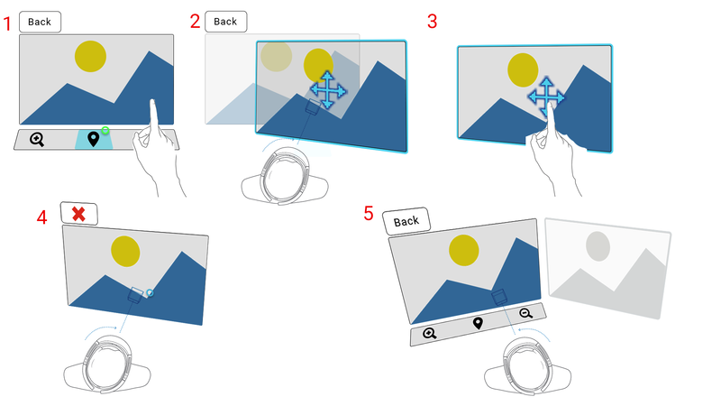
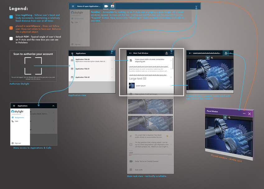
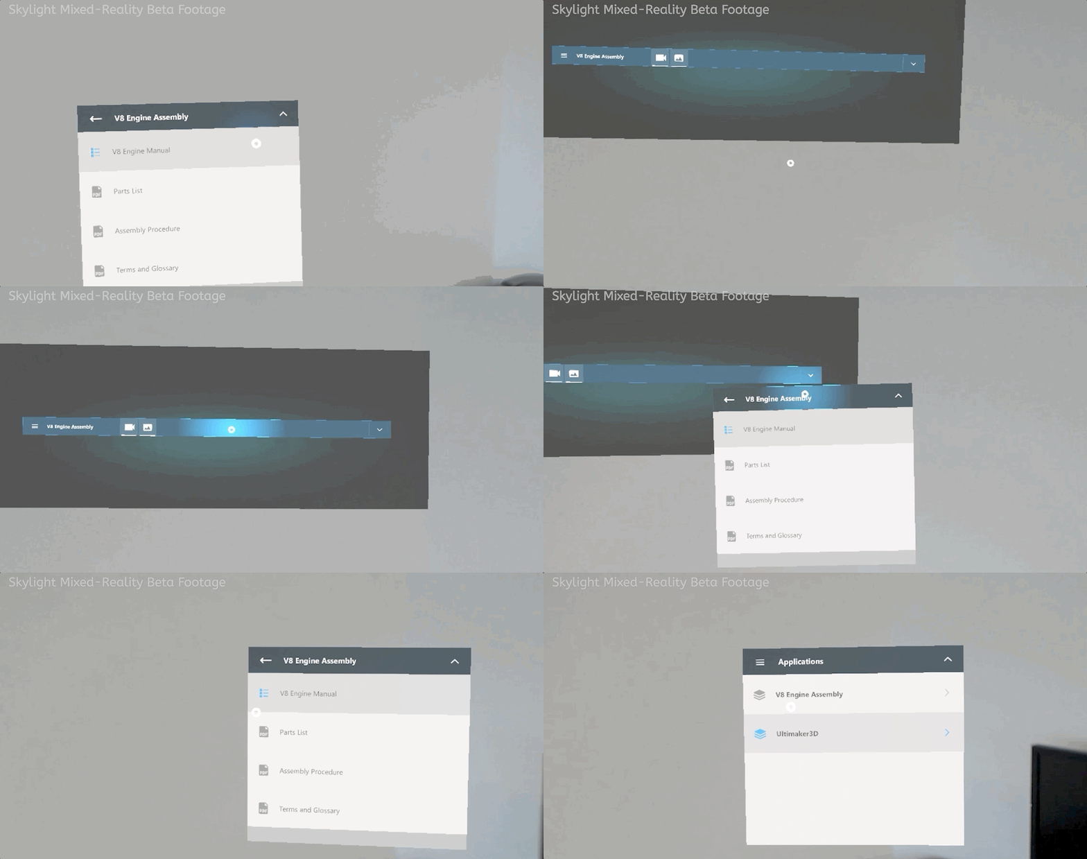
Skylight provides users with a "Main task" window that follows the user as they move through space, orienting to face them so they can quickly consume information at any moment.
|
|
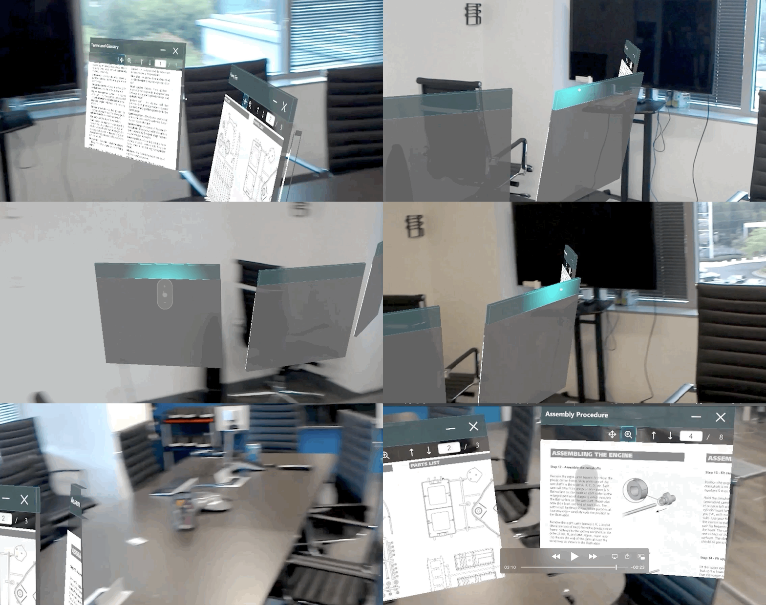
Placed windows are automatically oriented to the current gaze angle and at approximately arm's length from the user. This is the natural distance most people hold a piece of paper to read it and an optimal placement for ocular convergence.
|
|
Spatially oriented sound during video playback as well as during placement helps users locate windows falling outside the camera frustum.
|
The Core Loop
|
A second set of design challenges revolve around the fact that MR is a Wild West in terms of accepted standards and common practices for interaction. Designers (and thereby end-users as a whole) have not yet converged on the best methods to approach any one set of interactions. This was common in early mobile design and will equalize over time, but for now, designers cannot safely assume a collective unconscious, whereby users intuitively understand how to interact with their MR-based products.
|
A design should decrease, not increase, cognitive load. |
|
There are so many new, novel ways to interact with surfaces that the user quickly becomes overwhelmed by choice and uncertainty. The last thing I wanted to do was introduce ambiguous interaction affordances that left users guessing just because MR allows for novel design. Skylight is a platform about getting work done, not adding more work.
So the design challenge was how to provide users with a familiar interaction paradigm on a new platform while minimizing interaction and setup time for any information or screen the user wanted to consume. If I could lower the time to setup windows, I could keep workers focused on their job, not the device. |
|
Based on research with Upskill's customer, I knew that almost all users interact with a desktop PC in some fashion during their typical workday. This led to an obvious opportunity to align around a familiar software interaction paradigm, thereby reducing cognitive load and decreasing ramp-up time: the computer desktop.
Skylight for HoloLens UI screens would behave like application windows on a desktop PC or Mac computer. The same interactions used to resize and move windows on a PC would work on Skylight for HoloLens. This allowed for an easy transition to MR. You just tell the user to interact with it like desktop computer screens and they rapidly catch on. Similarly, interactions like zoom mirror familiar affordances found on mobile platforms. The UI is purposely familiar and controlled to limit the amount of change a user has to consume before getting to work.
The core loop works like this:
|
