PDLIPMAN ®
  • Home
  • Projects
    • @ Upskill >
      • Augmented Reality >
        • Design for HoloLens
        • Design for HoloLens 2
    • @Homesnap
    • @ EA >
      • Dungeon Keeper
      • Ultima Forever: Quest for the Avatar
      • Warhammer Online: Age of Reckoning
    • Personal
  • Resume
  • Contact

Enterprise Design for HoloLens 2

Rebuilding Skylight's mixed-reality experiences on the next-gen Microsoft device

Introduction

HoloLens 2 is an evolutionary leap over its predecessor in almost every way imaginable. It delivers a larger FoV, better performance, and the natural, gesture-based controls users clamored for in the original.  Additional modalities such as near and far interaction controls, as well as gaze-based targeting, meant that Skylight for HoloLens 2 could not simply be a port of the original client: It had to be completely redesigned from the ground up.  Upskill was fortunate to be an early trusted partner with Microsoft, which meant access to prototype hardware and the ability to work closely with the Redmond-based team.

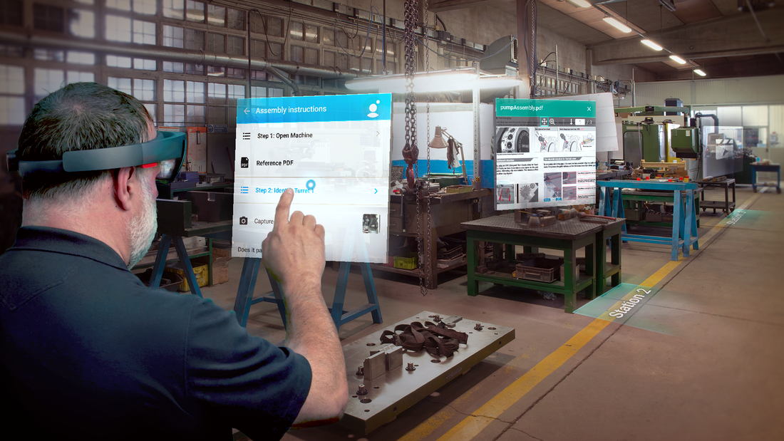
​We used this access to its fullest, iterating product design everyday, clocking the most on-device dev time of any early access partner prior to general availability. During this time, I was able to really stretch my skills, performing 100% of the design work, building all the 3D and 2D interfaces and animations, rapidly prototyping with engineering, producing robust documentation, and delivering a polished, high-quality, engaging user experience.
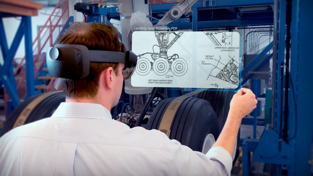
PDF Resize in Skylight for HoloLens 2 © Upskill

Challenges

  • Preliminary design work had to be started prior to device access.
  • Early access MRTK (Microsoft's "Mixed-Reality Toolkit") and beta tech meant working through incomplete process documentation and development bugs.
  • Difficulties translating dynamic, data bound workflows to a platform largely geared towards static 3D-content​.
  • Keeping interfaces grounded in reality to ease learning curve for novice users.

Hitting the ground running
Approaches to the prototype and conceptual phase

Preproduction on the Skylight for HoloLens (2) client started in early 2019, with the official public announcement of the device by Microsoft occurring on February 24, 2019. The timing meant that work needed to be started prior to device access or even knowing the full capabilities. At the time, all I knew was that the FoV (Field of View) would most likely be improved, and that the device would be capable of supporting more complex hand gestures than the original HoloLens.
With this knowledge in mind, I started exploring a series of questions using 2D concept art and then following that up with 3D prototypes running in the original HoloLens device. These visualizations helped garner buy-in and align the company around a direction.  It was an effective tool to puzzle through key questions based on our experience building the first Skylight for HoloLens client. ​

Musings on mixed-reality design
Normalizing an out of body experience and the importance of physical analogy mapping

At a purely functional level, some early questions that needed to be addressed were: 
  • What is the nature of mixed-reality? What does it do well? What is is poor at?
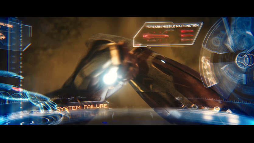
  • What is the best way to convey and interact with information? Should interfaces be abstract (like Iron Man's heads-up display) or grounded in reality with control surfaces symbolically representing their real world equivalents?
  • What were the basic building blocks for the UI and what common terminology needed to be established so the team could all speak the same language while working through construction of a novel system?
IronMan 3 Interface © Marvel
IronMan 3 Interfaces - © Marvel, Courtesy of John Likens
And from the perspective of the business, additional questions included:
  • Why would a customer select mixed reality over a traditional informational system like a mobile phone display?
  • What advantages does it have over traditional mediums? 
  • The HoloLens is expensive relative to established hardware paradigms. What killer features distinguish mixed-reality from other platforms providing a good return on investment?

Solving for presentation

After pondering the nature of mixed-reality and its practical use cases, I came to the conclusion that MR (mixed-reality) works best when the "virtual" surfaces a user interacts with are diegetic, meaning they are grounded in reality as opposed to the translucent (typically non-diegetic), abstracted lines and animations seen in recent blockbuster action flicks. In short, surfaces should be kept physical, conveying weight and volume, rather than the distinctly future-forward airy, flattened interfaces seen in the movies.  Much like in the early days of mobile phone design where skeuomorphism bridged the gap from analog to digital, the same mental bridge would be needed to transition users to the future of mixed-reality.
This approach has several advantages:
  • Humans evolved over thousands of years to be great at interacting with the physical world. For instance, studies have shown babies intuitively understand the physicality and permanence of objects almost from birth. Therefore, an MR interface that is grounded in the physical has an inherent advantage over an abstract one in that users will more quickly intuit how to interact with it.
  • Literature and life abound with symbolic meaning.  Categorizing functional surfaces into symbolic representations means users are able to derive functional purpose at a glance. This has the advantage of lowering the learning curve in a novel system.

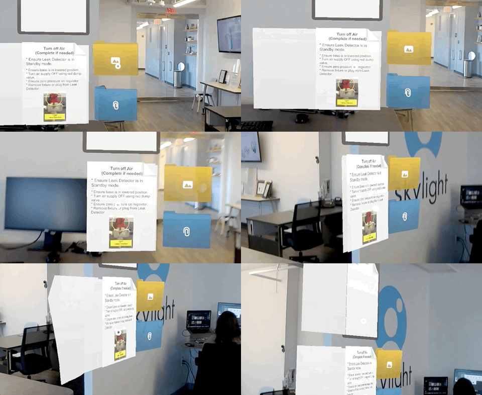
Folders

In business, people place groups of similar information into folders to stay organized. Additionally, folders are understood to be convenient carrying cases.  Incorporating virtual folders into the design meant I had a ready-made symbol to indicate to users that content was grouped together.
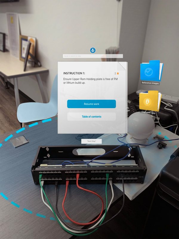
Concept - Physically grounded work instructions
Early concept art - Physically grounded work instructions
Prototype running in HoloLens 2
Prototype running in HoloLens

Clipboard

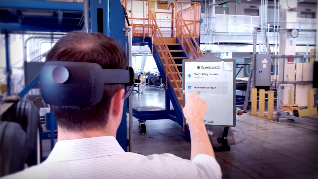
Clipboards are used throughout the world to bind paper task lists together.  They are highly-portable, at-a-glance instructional aids.  Skylight for HoloLens incorporates a moveable clipboard to serve as the user's point of entry into their main list of  assignments, much like a mobile home screen.

Virtual paper

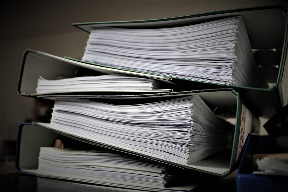
One of the earlier lessons I learned from building various customer workforce enablement solutions prior to my work on HoloLens was that paper is a superior product. If you are going to digitize a paper-based solution into a mobile phone, smart glasses, or a HoloLens, you better make sure your solution can beat the versatility of ink of cellulose. 
  • Paper is a timeless solution.
  • Paper is easy to hold, bend, and markup.
  • It comes in standard sizes. 
  • It can fit in tight spaces.
  • It can convey a variety of information in multiple ways.
  • It can be laid side-by-side, allowing users to compare multiple sets of information at once. 
  • Paper is not intimidating!​
​
​At the end of the day, an employee's job is to efficiently perform quality work. Any interface with a steep learning curve or that is too far reaching is going to fall flat. Paper is efficient, flexible, and commonplace. Virtualizing paper sounds silly, but it is simultaneously easy to explain how it works (users just "get" it), while allowing the business to move from analog to digital processes with all the inherent advantages that step entails. ​
Early page (Skylight "view") transition animation in Unity.
Final page scroll and view transition animation with dynamically loaded content.

And more…

Additional examples of spatially placed surfaces, user interactions, and interface affordances.
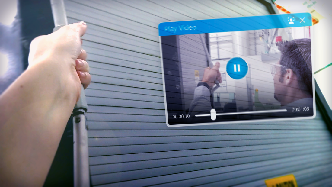
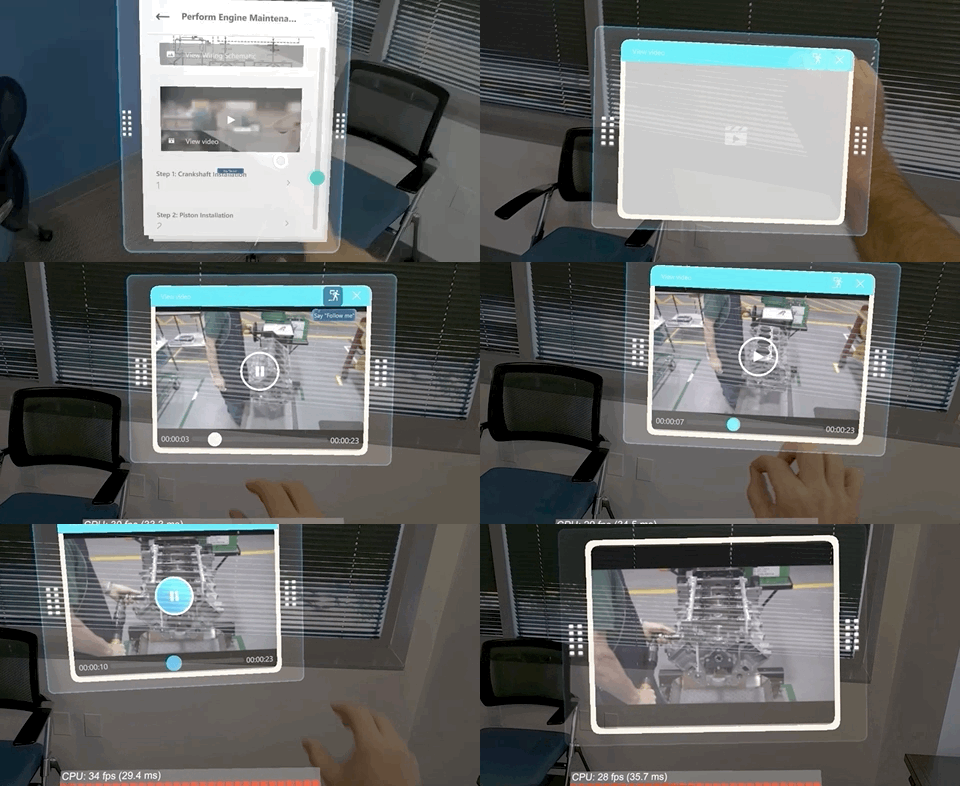
Video playback © Upskill
Selecting an assignment from the clipboard © Upskill
Video playback and window © Upskill

"Peter's work was instrumental in Upskill's product offering supporting the Microsoft HoloLens, in which he owned the end-to-end UX from visualization, layout, 3D topology, and human computer interaction. I had received very positive feedback from Microsoft's own UX team about his expertise. Secondly, his vast knowledge of full stack software development means that he's able to connect with every stakeholder across product, engineering, and UX in a contextually relevant way. What this translates to is everybody at their best productivity."

- Jay Kim | Augmented Reality Business & Product Leader

Watch closely

Another unique challenge in designing for MR is that users tend to move, but the objects they place in space do not.  In typical mobile applications, the user carries their phone with them everywhere they go so nothing can be left behind (unless they forget their phone!). A mobile designer does not need to consider what happens if the user forgets to close a page containing application content when it has been physically placed halfway across the factory floor.  Additionally, while diegetic mappings work well for the core platform experiences, there are some data concepts, such as signing out of the software or checking network conditions, that don't map well to natural, physically-based symbols.  
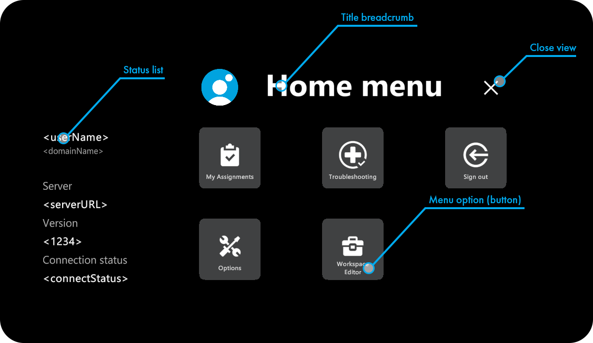
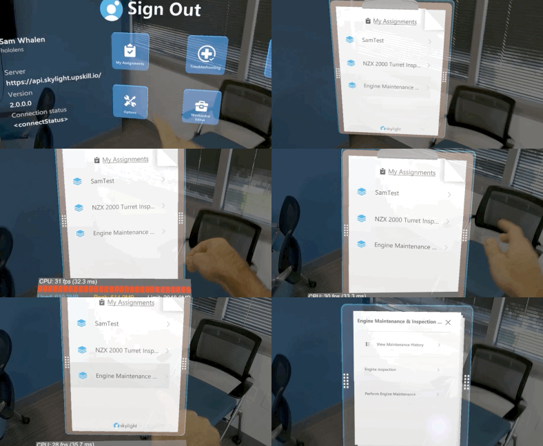
In practical terms, Skylight requires a level of  globally accessible menu options, allowing access to deeper functions.  The solution to this problem was to have a home menu that appears in front of the user when recalled. It contains the Skylight level functions and non-spatial aspects of the system. It additionally allowed a user to quickly recall their assignment clipboard should they have left in another room.
Example of the Home Menu from product documentation © Upskill
Recalling assignment clipboard via the globally accessible main menu in Skylight for HoloLens.Picture
Recalling assignment clipboard via the globally accessible main menu in Skylight for HoloLens © Upskill
With this in place, the question became one of access. How could a user readily access a menu that had no physical placement in space?  Voice was one option, but depending on the sound-levels in an industrial environment, it is not always reliable (Voice became a valuable secondary method of access). 
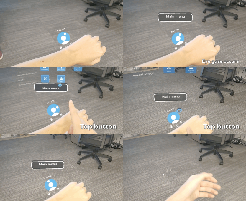
Moreover, some system statuses like battery level and network connection need to be quickly accessed.  I didn't want to force them to have to pull open an entirely new experience just to check the battery level. We needed a user interface that the user always carried with them, but one that left their hands free for work. The solution was to combine several advanced features of the HoloLens 2 into what we called the wrist-worn menu, or simply: a watch.
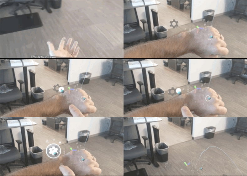
Using a combination of hand and wrist bones, we devised a method to naturally anchor a watch above the wrist, only appearing when the wrist was rotated towards the user. Additionally, to minimize visual clutter, we added a button to access the global menu, but it only appears when the user's gaze falls on the surface of the watch. 
Initial tests to suss out watch-based menu approach © Upskill
Early watch prototype with simulated global menu built-in.
Early watch prototype with simulated global menu built-in. Watch anchors more naturally when viewed on device © Upskill
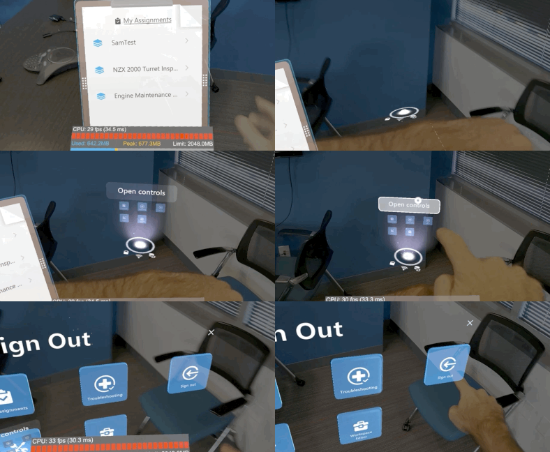
The initial prototype proved this approach was a viable solution and a delighter so we continued to refine the design, adding an Iron Man-like interface (see image). But, in user testing, people wanted to touch the simulated global menu buttons (which are really just a billboard) that appeared above the watch, rather than press the "Open controls" button.
We continued to iterate through the design and animation transitions to produce the final result:
  • Pressing the "Main menu" button toggles the appearance of the global menu.
  • The expanding main menu animation was improved to scale out from the watch up to the user's current head position (and back again).
  • We added a clock and Skylight branding to the watch as well as at-a-glance access to network, battery, and server status.
Final watch interface in Skylight for HoloLens
Final watch interface in Skylight for HoloLens © Upskill

Back to the future

Over the course of developing Skylight for HoloLens, we implemented many features including the ability to capture images and videos, support for viewing multi-page PDF documents, the ability to pan and zoom around images, playback of videos, text readers, voice-based navigation, and much more.  Despite all this, there was always the looming question of why a customer would select mixed reality over traditional ways of consuming data. Skylight for HoloLens needed a killer feature. 
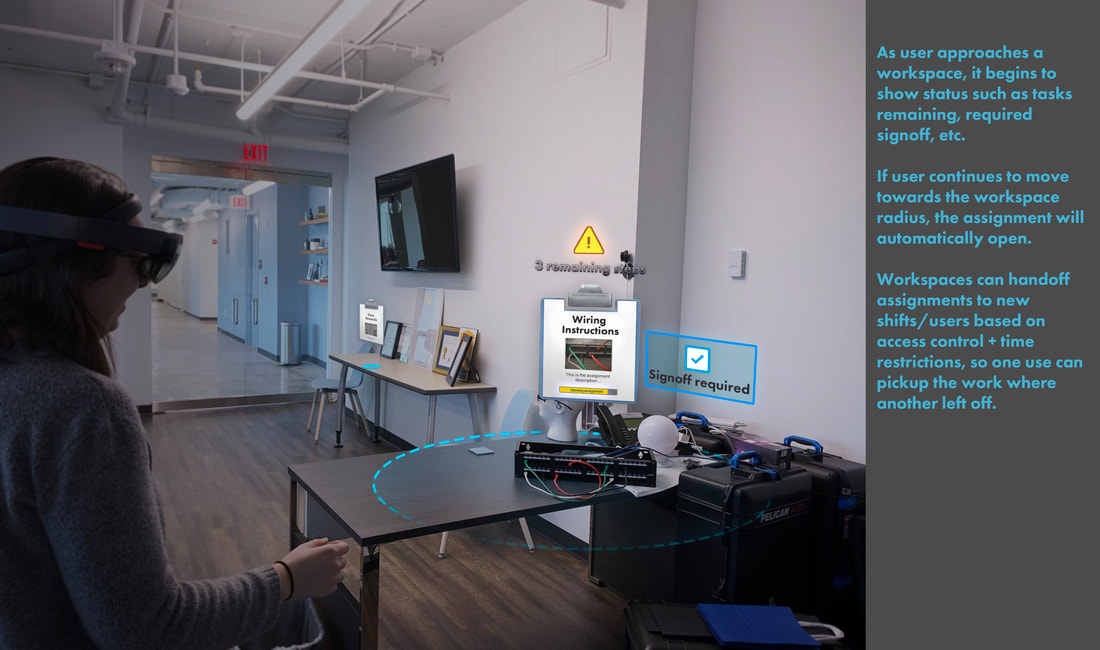
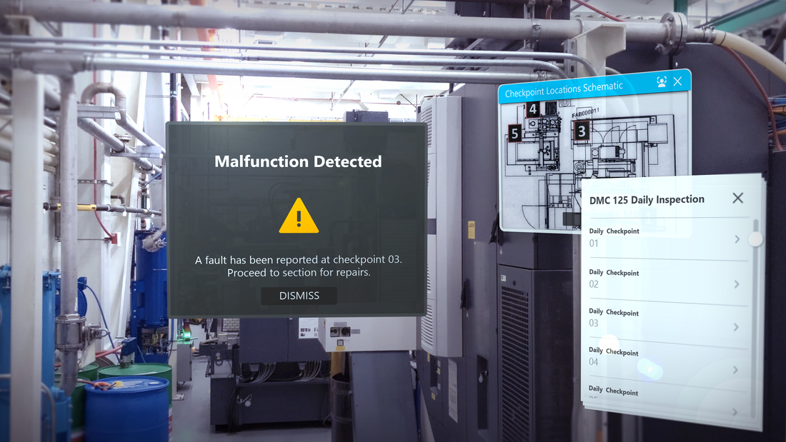
Exploring how placed content could alert a user of its own needs, such as a potential safety consideration or fault © Upskill
During the concept phase, I narrowed in on one of the big advantages mixed-reality has over phones: spatial placements.  I began to explore something I called "workspaces", which were collections of spatially-anchored, contextual content.  The concept has two parts:
  1. Users place individual pieces of content around their workstation in the world.  Skylight would then analyze relative proximity of placed objects to one another and group clusters of content into something called a "workspace".  This allows Skylight to reduce the visual noise in the world by effectively performing a LoD (level-of-detail) reduction on the content in a workspace, only showing a representative point of interest until a user with access permission enters the radius of the workspace. Skylight then reveals the content of that workspace to the user. 
  2. Taking things a step further, collections of content can be built into the assignment workflow by a process manager.  The placement can be contextually aware of its needs and status.  The idea being that shift-based workers could hand off progress to each other or that a piece of equipment can alert nearby users of issues or upcoming repairs.  Different personas can experience different parts of the workflow as they interact with the spatially placed content. 
​Early proof of concept running on HoloLens (1).
Picture
Example of location-based equipment alert.

Dynamic system design
Avoiding the trap of hand-crafted construction and how enterprise dictates design

At a practical level, the client design needed to account for the dynamic scalability of content at runtime. This was a major challenge because traditional 3D assets assembled in Unity tend to be static with all data known prior to compilation. In fact, Microsoft's own approach to physically-based interfaces relies heavily on 3D assets for touch interaction.  That approach would not work for a system like Skylight where displayed content is data-driven:  the content in an application is unknown until a user logs into the system.
Skylight bidirectionally streams data to construct user applications on the fly while encrypting and passing captured content back to a centralized storage solution. Any layouts need to scale and constrain based on the content, but 3D assets don't like being transformed non-uniformly like this: Collision boundaries, animations, and other visual anomalies can occur. 

To get around non-uniform scale issues in the original Skylight for HoloLens client, 3D interfaces were restricted to square windows with a 2D canvas serving to render all dynamic data being placed in front of the 3D panels. The whole window would scale uniformly larger when a corner was dragged. The resulting solution was functional, but limited:
Picture
Example of Skylight for HoloLens (1) control surfaces.
HoloLens 2's dual touch and gesture-based interface meant that 3D had to be used since 3D touch requires z-depth to register button press actions. Therefore, new solutions and approaches were required.  I was confident that I could design a system that would meet the functional needs while simultaneously raising the visual bar amongst our competition.

Solving for resize and reflow

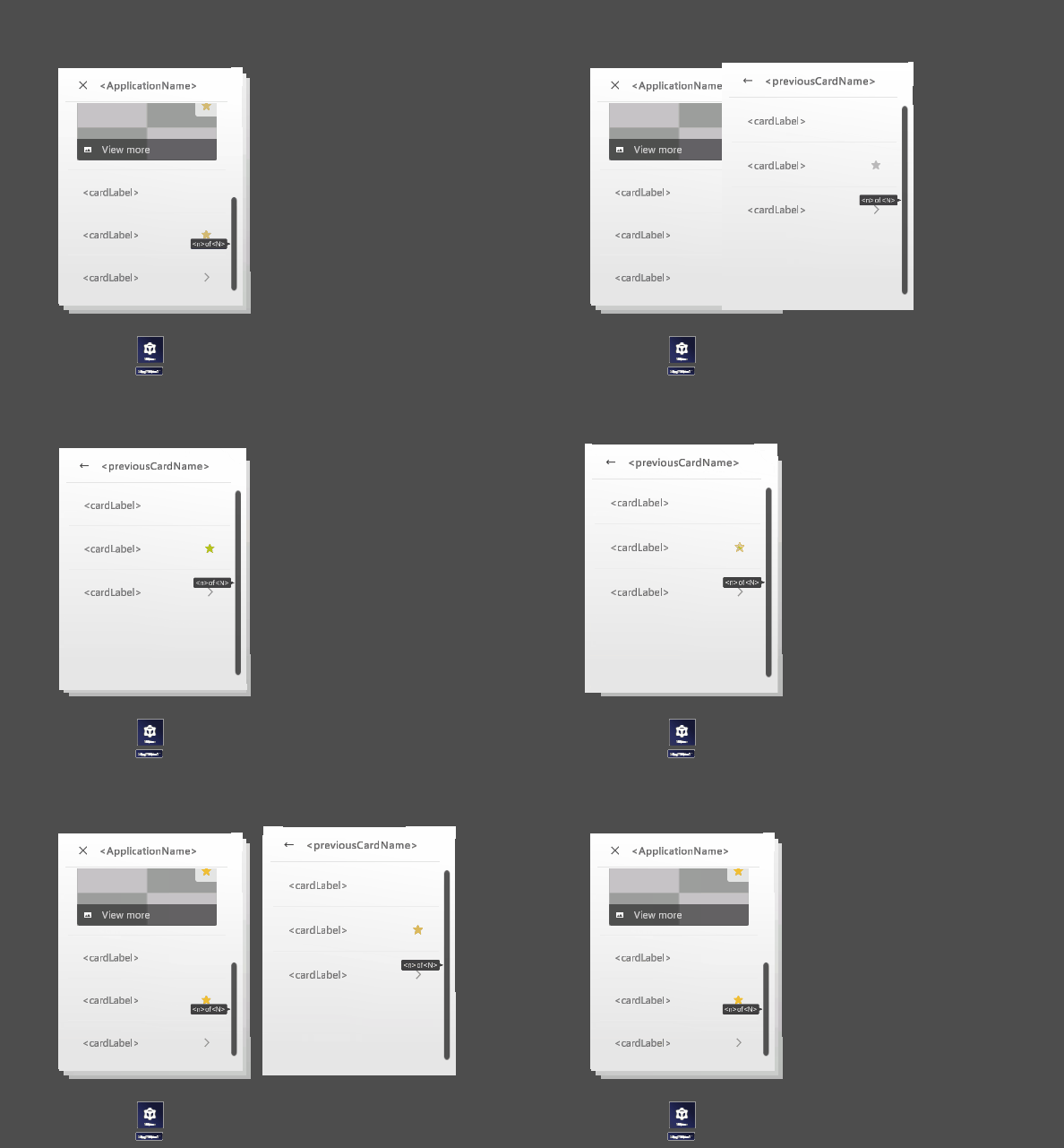
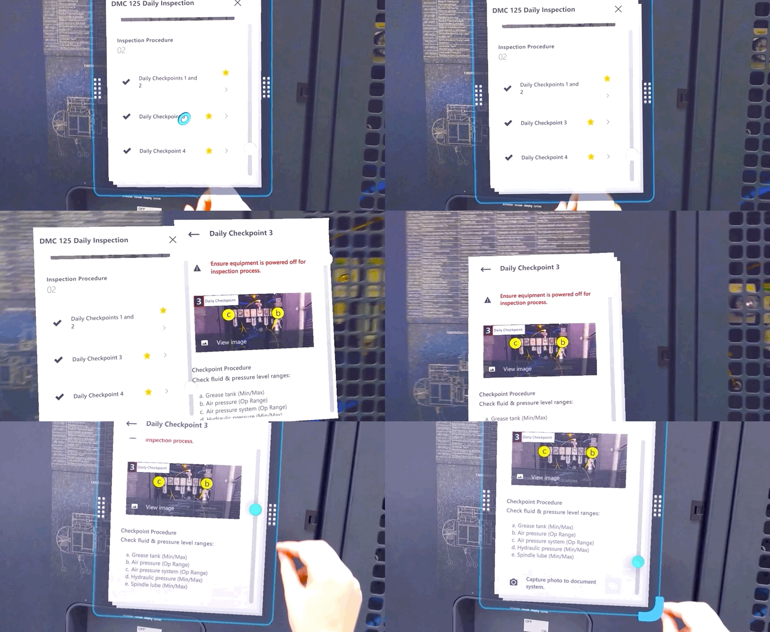
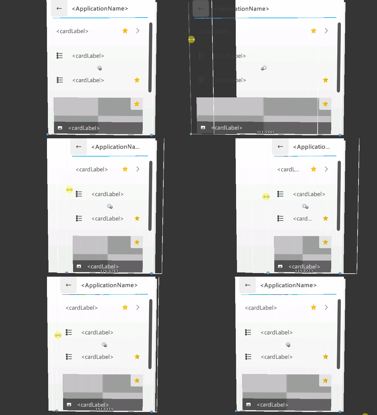
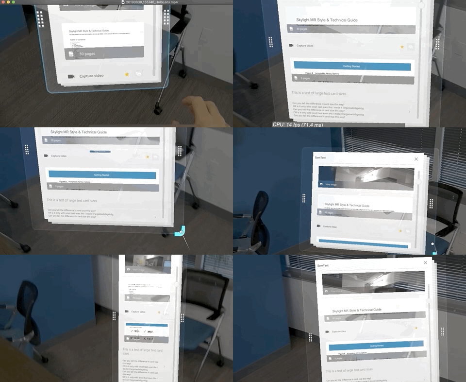
Skylight for HoloLens (2) utilizes a combination of 2D canvases for dynamically constraining elements with code to calculate and anchor the 3D interactables with the new sizes upon resize.  This was no easy feat and took a good deal of trial and error, fighting through bugs, and creative thinking across the team. The result is that a user can quickly size their instructions and reference material to suit their needs, simply by grabbing a corner of any placed document. 
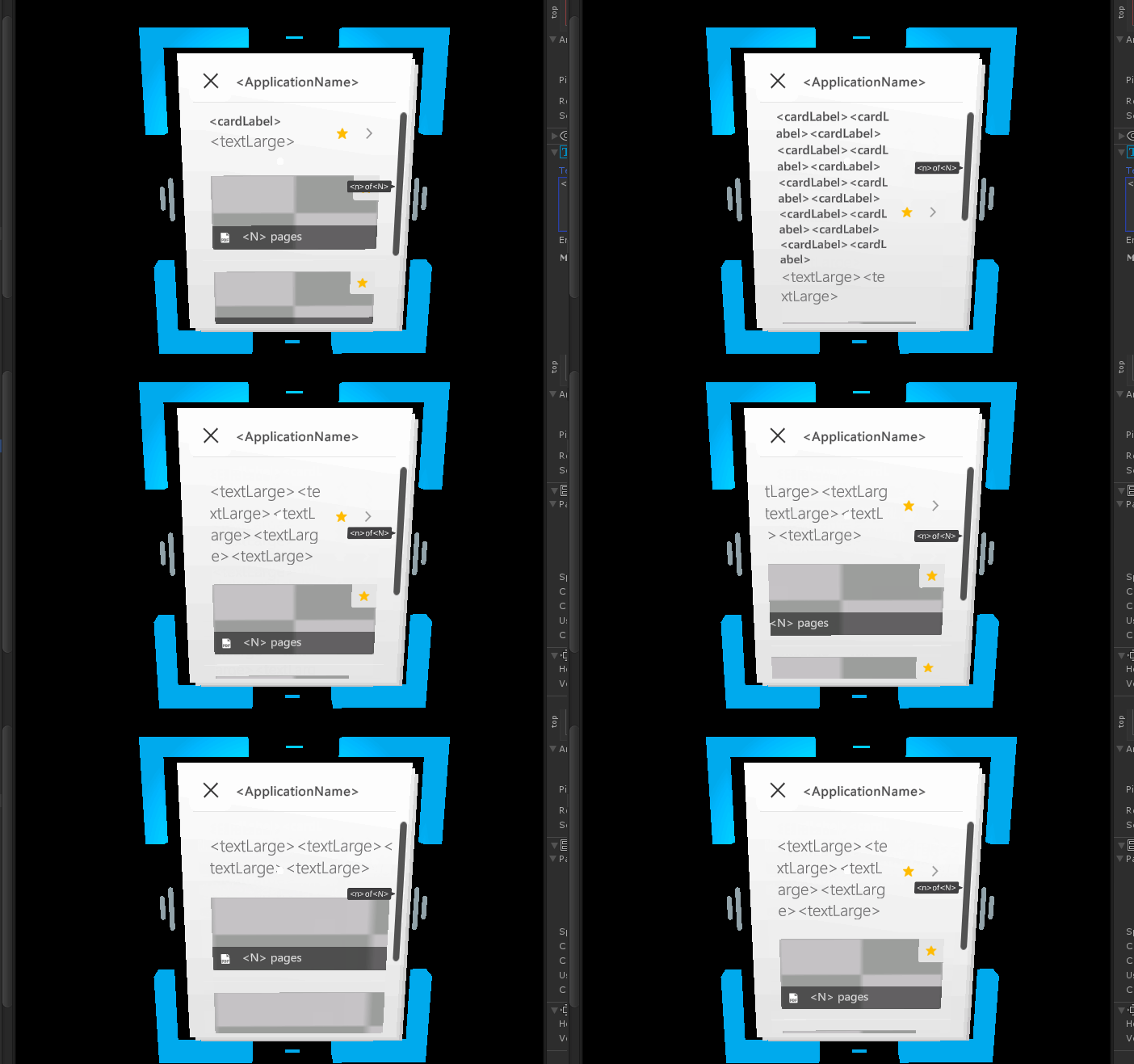
Horizontal layout constraints for multiple Skylight card types as demonstrated in Unity.
Example of internally reflowing content inside a card as demonstrated in Unity.
Final result running on HoloLens 2

Documenting the process


"For every minute spent organizing, an hour is earned." - Benjamin Franklin
Picture
Details coming soon…

Visually Mixing Reality

A breakdown of composition work used to produce the Skylight for HoloLens 2 hero imagery.
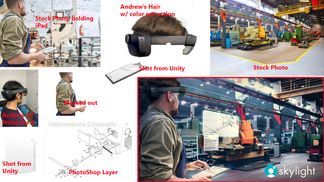
A visual breakdown of composition work to produce the Skylight for HoloLens 2 hero imagery.
Contact Me
All rights reserved. Please don't use, reproduce, re-post or alter artwork and images without written permission.
Artwork is an intellectual property and is protected by the copyright law.
PDLIPMAN.COM ® 2022
  • Home
  • Projects
    • @ Upskill >
      • Augmented Reality >
        • Design for HoloLens
        • Design for HoloLens 2
    • @Homesnap
    • @ EA >
      • Dungeon Keeper
      • Ultima Forever: Quest for the Avatar
      • Warhammer Online: Age of Reckoning
    • Personal
  • Resume
  • Contact